


if you can work on the HARMONIC.. I think the O should be a disc.. I like the way the doulble LL can be used as an H.
It wasn't my first thought.. the H was going to be below.
And I do have your e-mail- but I like the way glasshalfempty has started it off in the open...
so we all should keep going like that.
(I'm shit at working with other people ..so this is all done through gritted teeth!!!)
so this is what i mean by squaring it up and using the wine glass foot print as the dot.

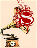
i then went doodlin' it's not how it should be.. but it's not echoing other things: but the O in harmonic should be a record, I've come to that conclution.

all that would be too much for a label.. because it's the band that matters (yeah right...says the designers)
so using the wine glass print the more subtle S.H. gets printed.
(this isn't a good wine glass stain.. again doodling..... if you can put your one into the image.. that'd be great)
 oh and a few songs..
back tomorrow with a proper playlist.
Earl Zinger it means a lot
3 comments:
Thanks, shane! I know what you mean about working with other people. I've just had a design-diva hissy fit at my best mate for "compromising my artistic vision" for the flyers for his cellar conversions company. I think the words, "Peter Saville never had to deal with this shit" were mentioned. Haha! ;-)
I do hope I haven't trodden on any toes though. I know I'm the new boy and I'd hate it if I have.
Right then, I getcha with the squaring it up with an apostrophe from the L now and have incorporated that with what I'd already been working on, based on the idea of the H under the two Ls and the record for the O.
Have posted below, along with how it would look on the record label.
No worries with treading on toes.. this is the best place to try out ideas.
I'd never worked on design using a computer until Blimpy set up the spill.. the people here are just the best to encourage your artistic side.
The re-done designs below are great - but Harmonic still doesn't look right. The H doesn't work fat, does it.
The wine glass stain is perfect like that.
The record as the O will work once the lettering for the Harmonic is sorted.
Design Diva hissy fits are just so part of the journey aint they!
Agree. I wasn't happy with the H like that either. Worth trying out the idea though.
Yeah, the wonderful world of Adobe is still fairly new to me as well. I basically taught myself to use it so I could produce promo material for the independent wine merchant I used to manage and discovered I had a bit of an eye for it. Unlike you, I can't draw a half-decent stickman with a pencil and paper, so this has really unlocked my pent-up creative frustration. Taking my first steps at using Illustrator now too. I just love the whole process of doing it; I'd rather sit there of an evening (or usually a late night) and do something like this than veg out in front of the telly anytime.
Post a Comment