As glasshalfempty said below, clearly shane's yer man for the 'Spill graphics, but, even as a bit of a Johnny-come-lately, I thought I'd take up the challenge and have a bash anyway, purely because I love doing it.
A combination of the red, white & black, the spill (red wine not paint!) and the apostrophe idea.
I'm editing the post as it develops as a work in progress. Thanks for the kind words, feedback and suggestions for improvement so far.
similar to what I first thought of before the record label idea came up.
I would just use the red wine circle as the logo.. wine glass sized. lettering/ band name inside on the label.
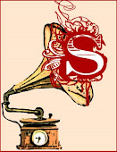
with your type: wine spill re- used as the dot on the i and the O in harmonic an image of a record.. the musical notation to me is too fussy. Make the H a capital (bolder type) and place it in line under the double LL of spill - same height as the lower case letters. and grab the top of one L to use as the diacritic/ apostrophe... squaring up the spill section.
If you get what I mean.. tweak it- BBeat.
but with V23 and saville influences we should get to a solution.
Thanks for the feedback, folks. I'm in the process of maybe/kinda/possibly/hell-I-gotta-do-something-I've-been-made-redundant trying to make a go of doing this sort of thing, having only learnt how to use the software in the last couple of years and it's nice to feel that I'm at least barking up the right tree and have some valid ideas. shane: I will tweak away with your excellent suggestions. Yeah, I think you're right now about the musical note; it was a first attempt at trying to cram in all the ideas that had been offered so far. I'd just come on to post a response to tin's first post, so have posted a simplified version without the "decoration" (although have kept the apostrophe)at the top. Will have a go at shane's ideas next.
it looks great! I love the wine stain, apostrophe and font style. Wasn't sure about the vertical line which reading has explained as a musical note - I would lose that. Await next steps with interest, AFTER YOU HAVE DONE YOUR REAL WORK. I'm avoiding mine by reading the 'Spill.
Design-wise, I think we could incorporate some of the elements in this clip, like the graininess that's actually already in BB's design: http://vimeo.com/4489687
We could call it a whine stain and record I Honestly Really Think I Have Something To Say But Might Realize In A Few Years When I Grow Up That I Actually Didn't confessional stuff. Oh wait, Lily Allen is already signed
I've been having a bash at incorporating your suggestions, shane, but you've lost me with "grab the top of one L to use as the diacritic/ apostrophe... squaring up the spill section", it being virtually impossible to describe something visual like this without being able to point, despite your valliant effort. Maybe email me (Tin and ToffeeBoy have my email address, if you have theirs).
Love A Kiss From Tokyo. When is that from? Is it 60s or modern?
I like the logo a lot, too, BB. Love the wine stain, and the spill font. THere's something too clean about it, though, maybe I'd like to see the "Harmonic" in a simpler font--more like the old record label fonts. I've read that ariel and futura are good for that. Great design though.


17 comments:
I like it without the decoration. Just spill and harmonic the way you have them. It could belong to any decade if - timeless not generic.
It's spiffin' - good to see some quality, after my pathetic efforts.
I'm still diggin it, tinny may be on to something - what happens if it gets reduced further?
um, then it would say Spill Harmo
The wine stain is 100% working for me!
That is one great logo. All we need now is some insane Shane artwork & perhaps some music.
similar to what I first thought of before the record label idea came up.
I would just use the red wine circle as the logo.. wine glass sized. lettering/ band name inside on the label.
with your type: wine spill re- used as the dot on the i and the O in harmonic an image of a record.. the musical notation to me is too fussy.
Make the H a capital (bolder type) and place it in line under the double LL of spill - same height as the lower case letters. and grab the top of one L to use as the diacritic/ apostrophe... squaring up the spill section.
If you get what I mean.. tweak it- BBeat.
but with V23 and saville influences we should get to a solution.
What do you think?
P.S will have to carry this on tomorrow as I'm slowly losing the will to finish stuff - THAT REALLY HAS TO BE DONE - in shouty type.
Thanks for the feedback, folks. I'm in the process of maybe/kinda/possibly/hell-I-gotta-do-something-I've-been-made-redundant trying to make a go of doing this sort of thing, having only learnt how to use the software in the last couple of years and it's nice to feel that I'm at least barking up the right tree and have some valid ideas.
shane: I will tweak away with your excellent suggestions. Yeah, I think you're right now about the musical note; it was a first attempt at trying to cram in all the ideas that had been offered so far.
I'd just come on to post a response to tin's first post, so have posted a simplified version without the "decoration" (although have kept the apostrophe)at the top. Will have a go at shane's ideas next.
it looks great! I love the wine stain, apostrophe and font style. Wasn't sure about the vertical line which reading has explained as a musical note - I would lose that. Await next steps with interest, AFTER YOU HAVE DONE YOUR REAL WORK. I'm avoiding mine by reading the 'Spill.
Design-wise, I think we could incorporate some of the elements in this clip, like the graininess that's actually already in BB's design:
http://vimeo.com/4489687
I'm loving it, the wine stain is genius.
We could call it a whine stain and record I Honestly Really Think I Have Something To Say But Might Realize In A Few Years When I Grow Up That I Actually Didn't confessional stuff.
Oh wait, Lily Allen is already signed
I've been having a bash at incorporating your suggestions, shane, but you've lost me with "grab the top of one L to use as the diacritic/ apostrophe... squaring up the spill section", it being virtually impossible to describe something visual like this without being able to point, despite your valliant effort.
Maybe email me (Tin and ToffeeBoy have my email address, if you have theirs).
Was trying to decide if I was being too rough on Lily Allen. Decided I wasn't. She doesn't do songs - she Twitters to music.
hey, i like that. I better get royalties if anyone uses it
Love A Kiss From Tokyo. When is that from? Is it 60s or modern?
I like the logo a lot, too, BB. Love the wine stain, and the spill font. THere's something too clean about it, though, maybe I'd like to see the "Harmonic" in a simpler font--more like the old record label fonts. I've read that ariel and futura are good for that. Great design though.
I think it's modern, but it's good that they make you wonder if it is really from 1964.
Post a Comment